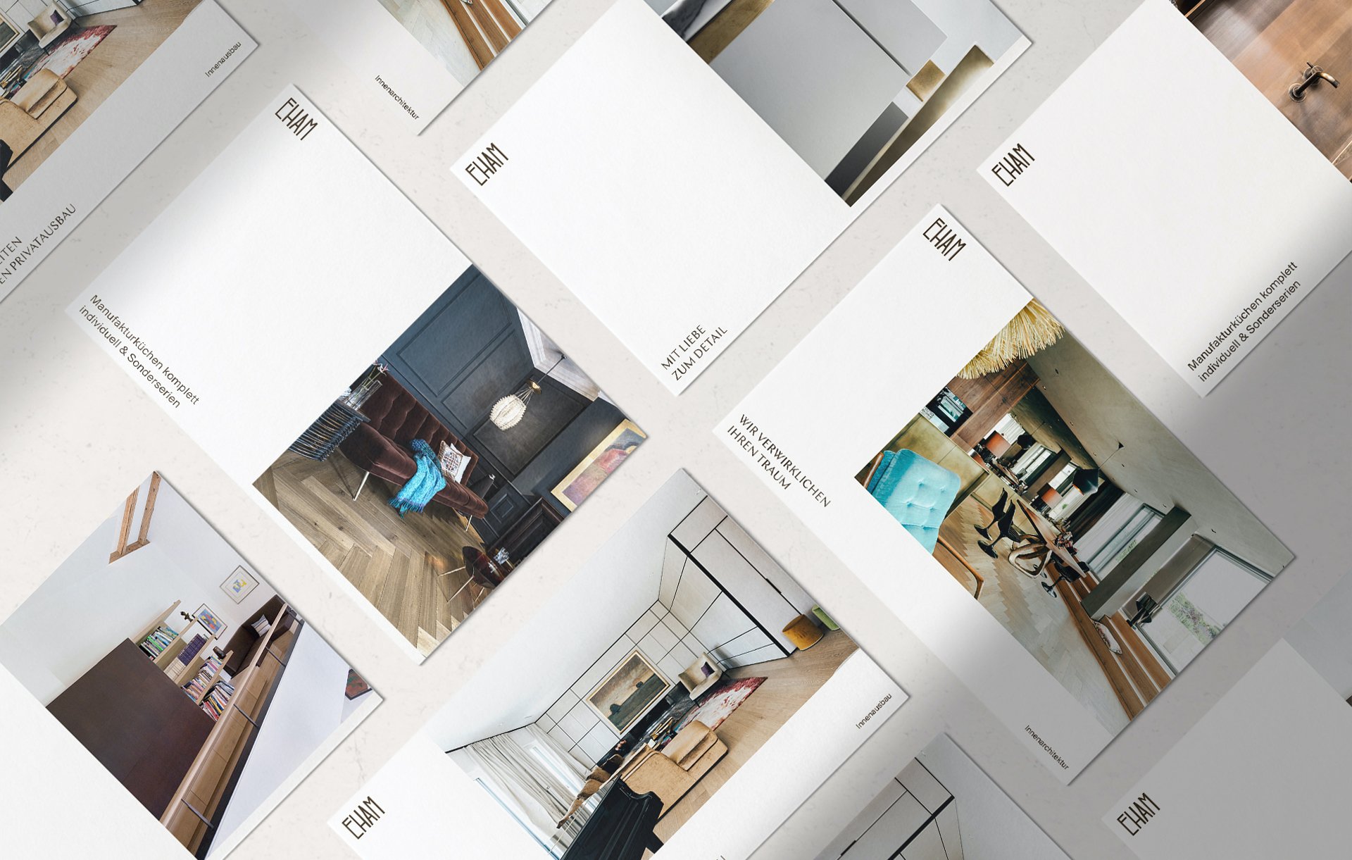
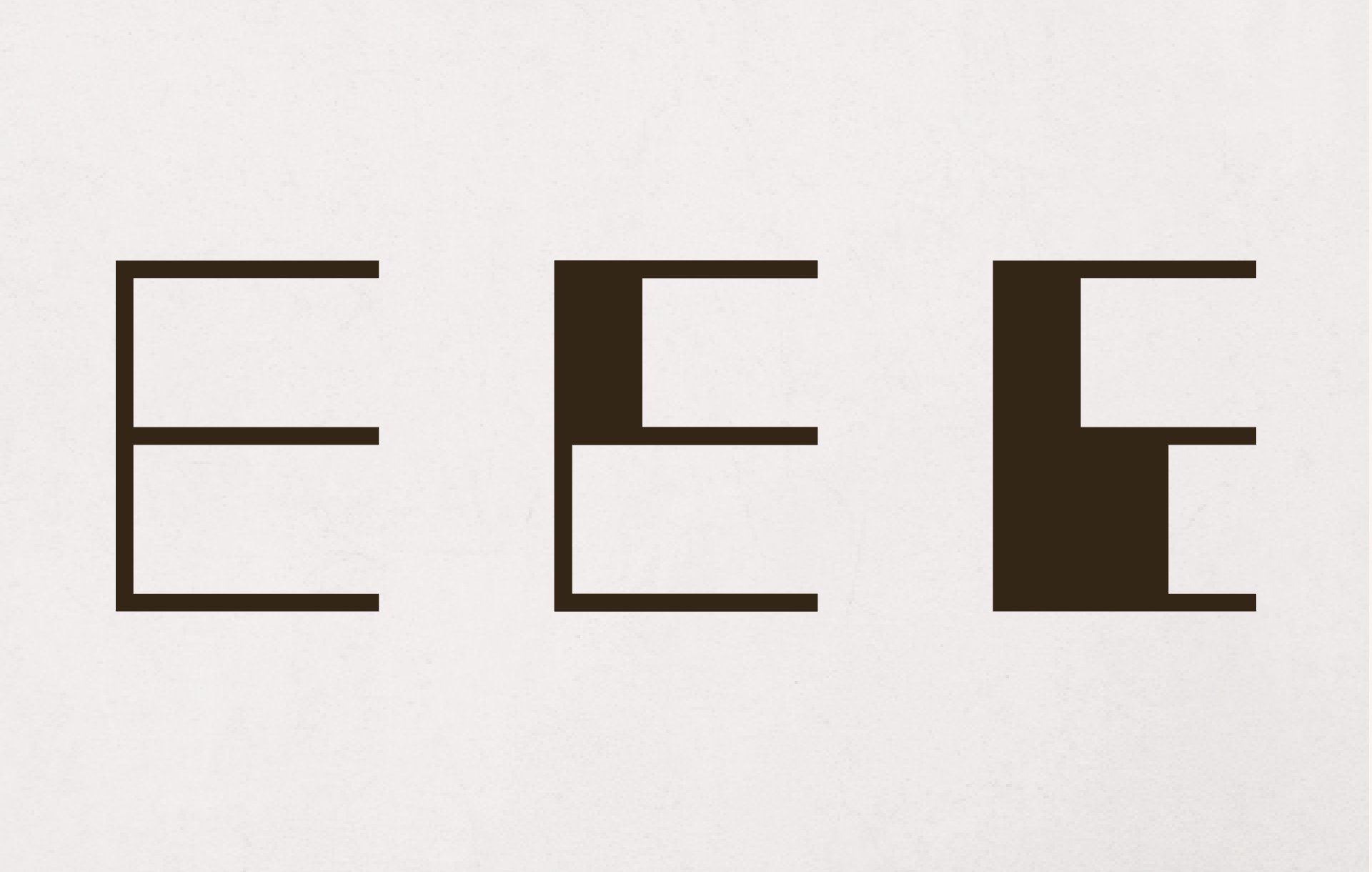
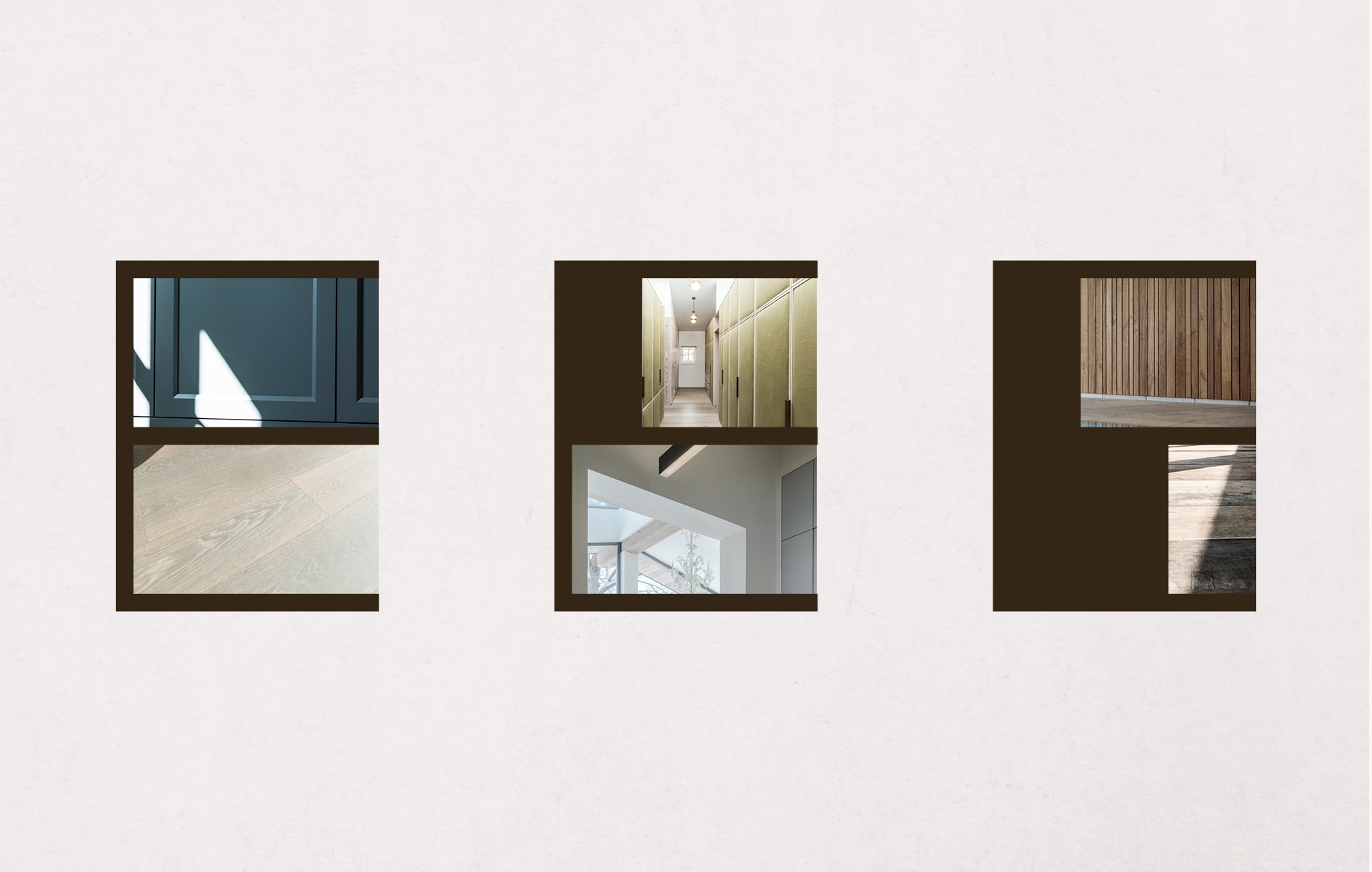
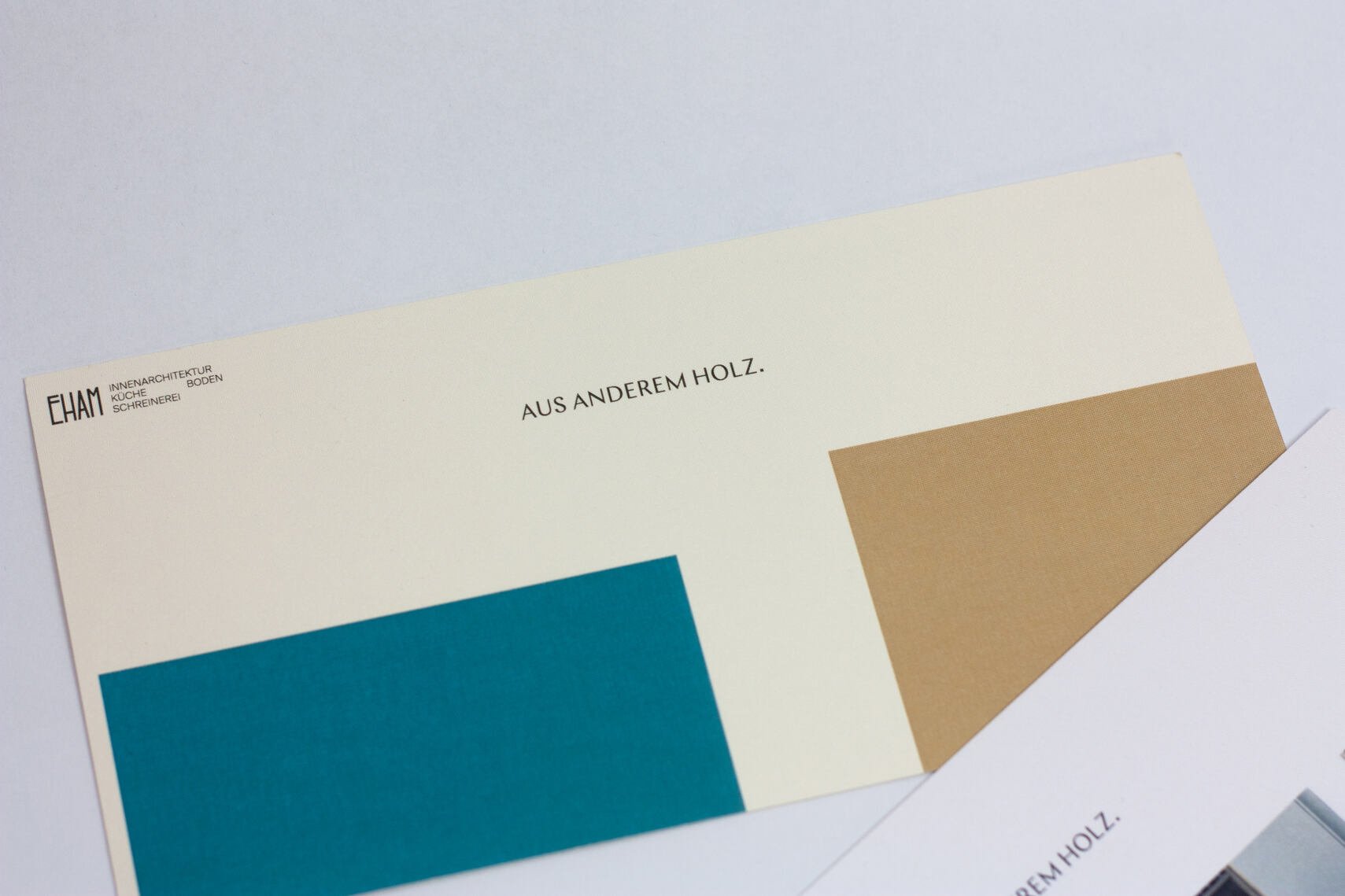
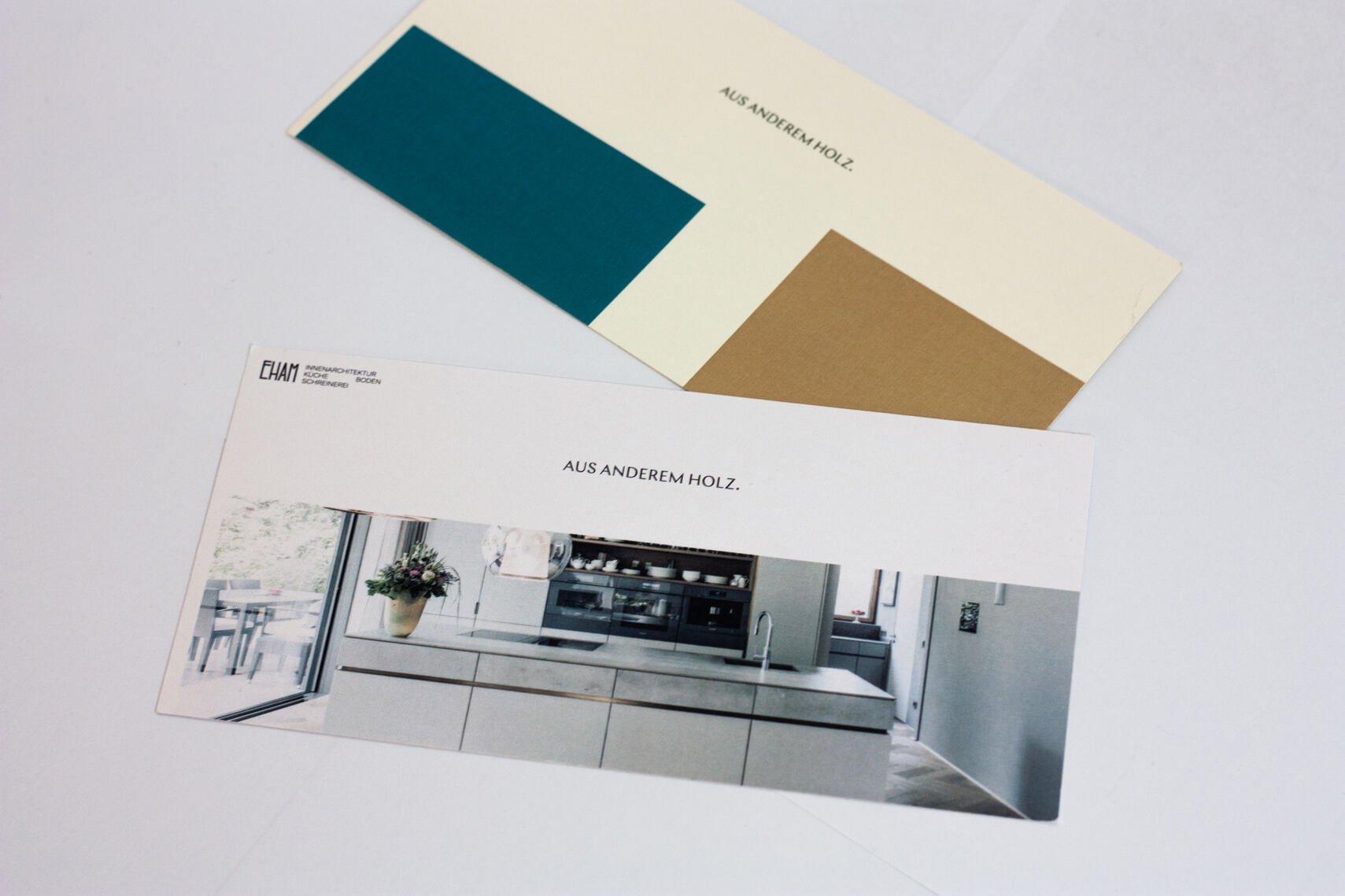
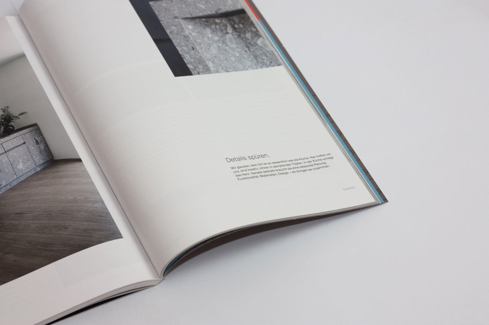
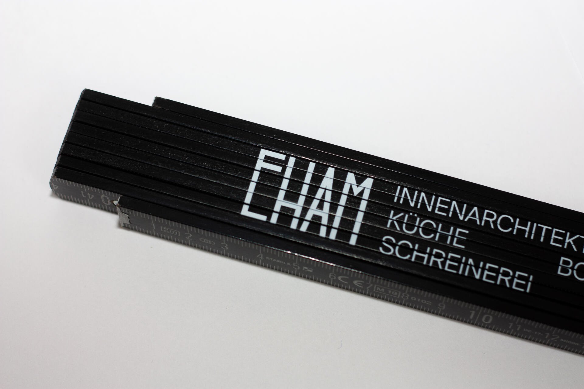
The logo’s most apparent association are its “joints” — the elements between pieces of wood, glued together, visible in floors or walls. These elements symbolize connection and precision. Moby Digg decided to incorporate those symbols into the new identity. The design team used the thickness of the letter as the starting point for the gutter between images, allowing for more architectural, modular, and constructed layouts. The final grid system derives from the letterform “E” by activating the left margins and distances between sections as composition elements. This results in a clean and tidy design, which plays with structure and building forms within white space, calling attention to the intricate interplay of wood structures and architectural choreography.
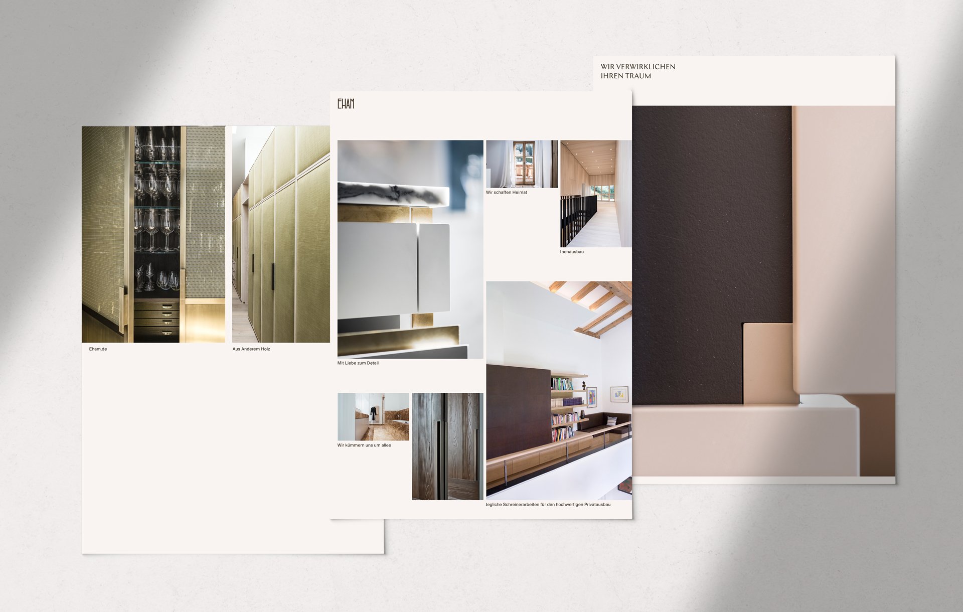
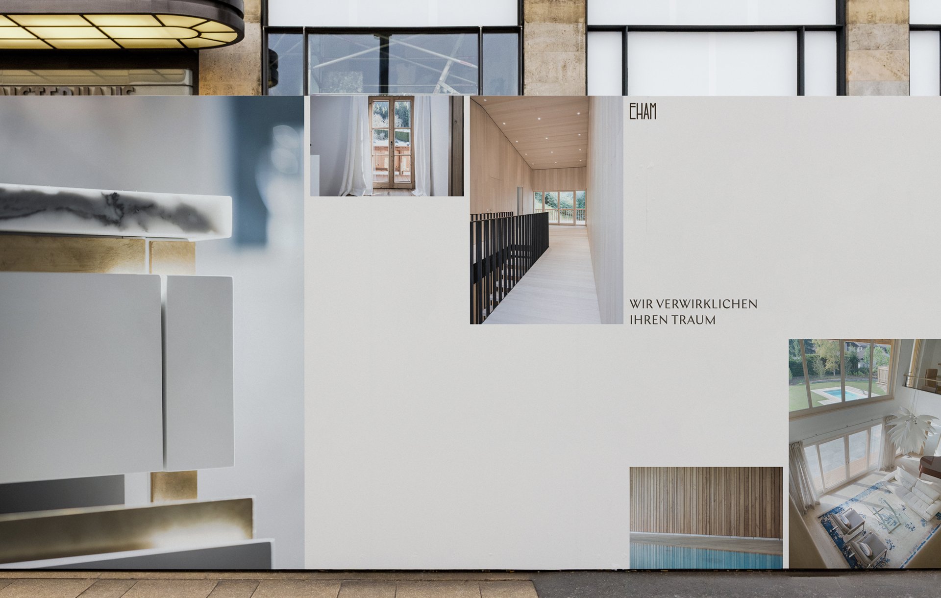
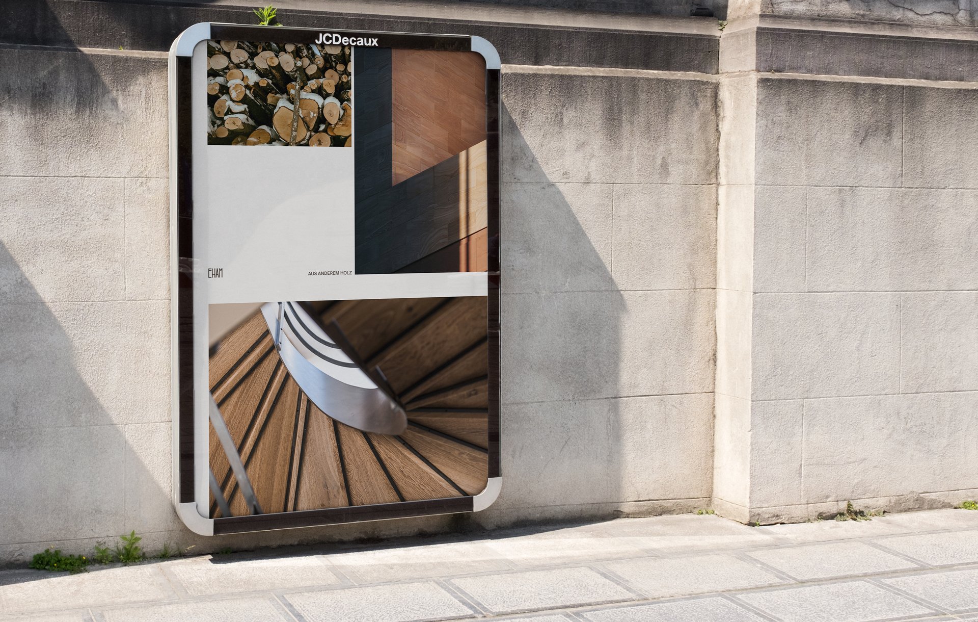
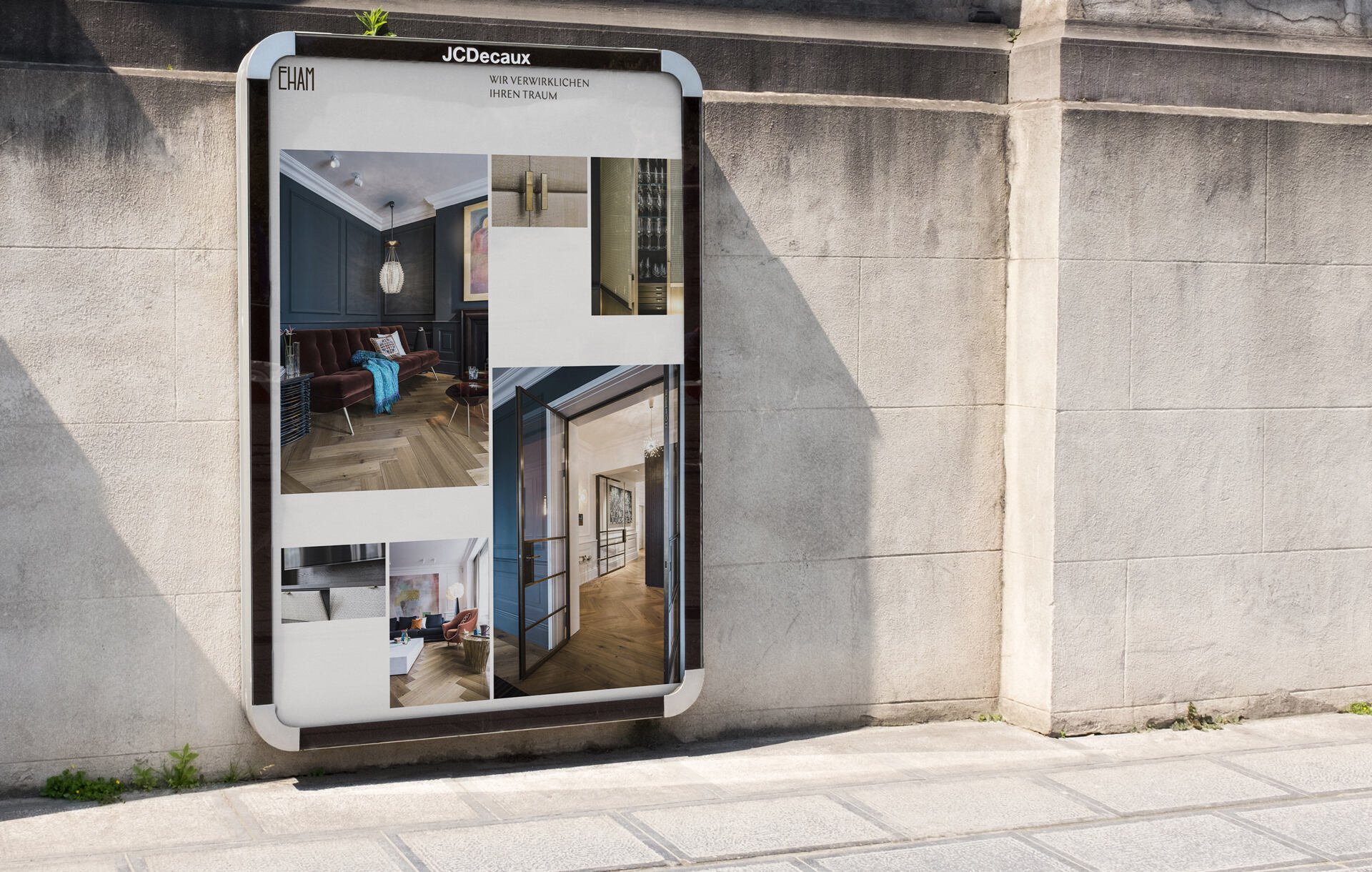
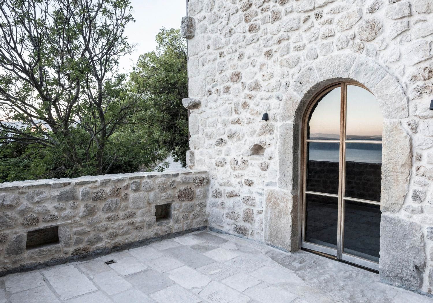
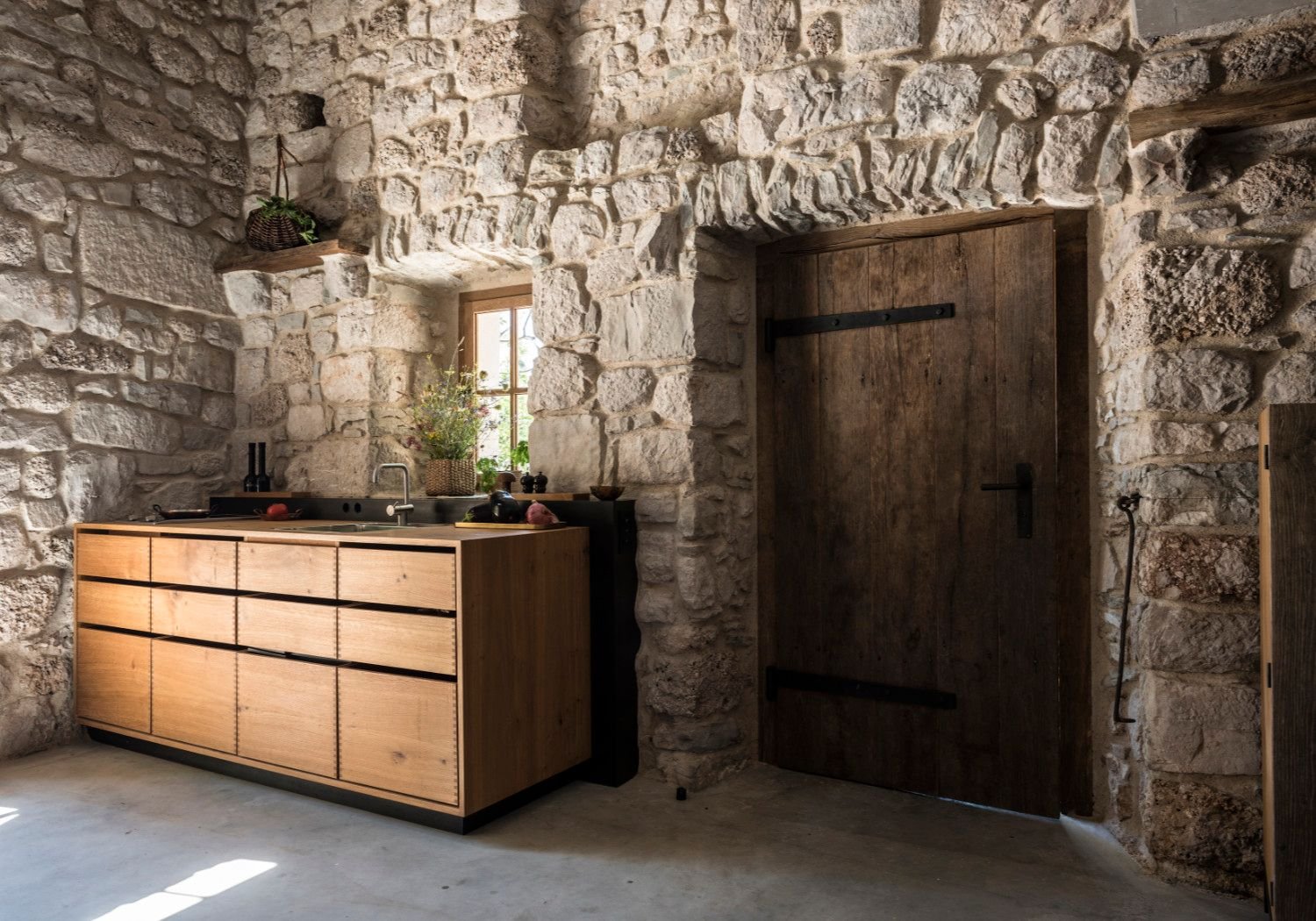
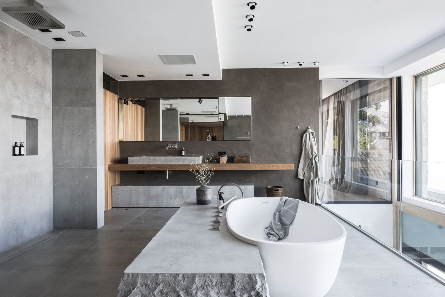
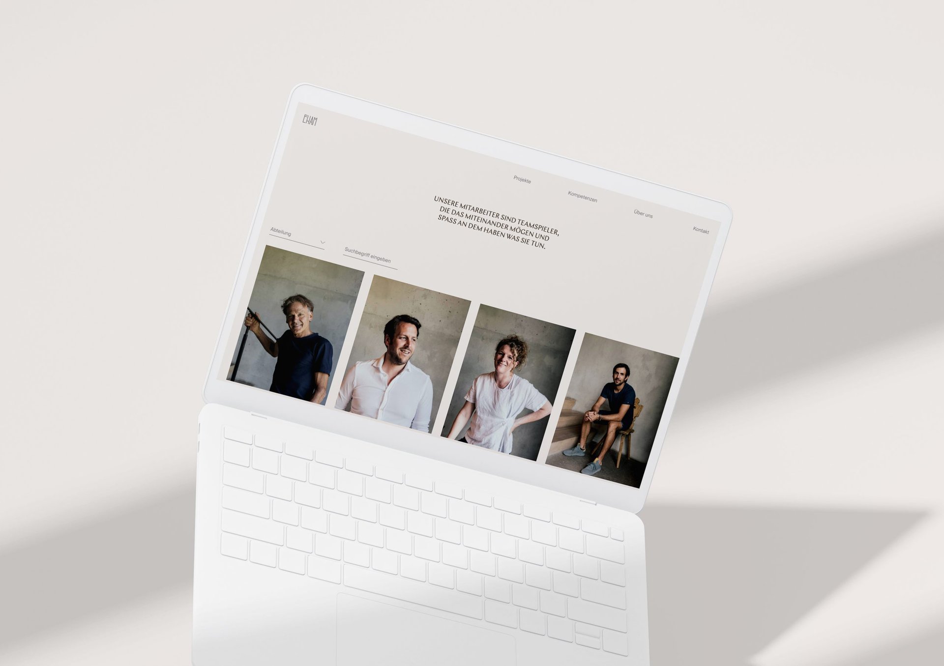
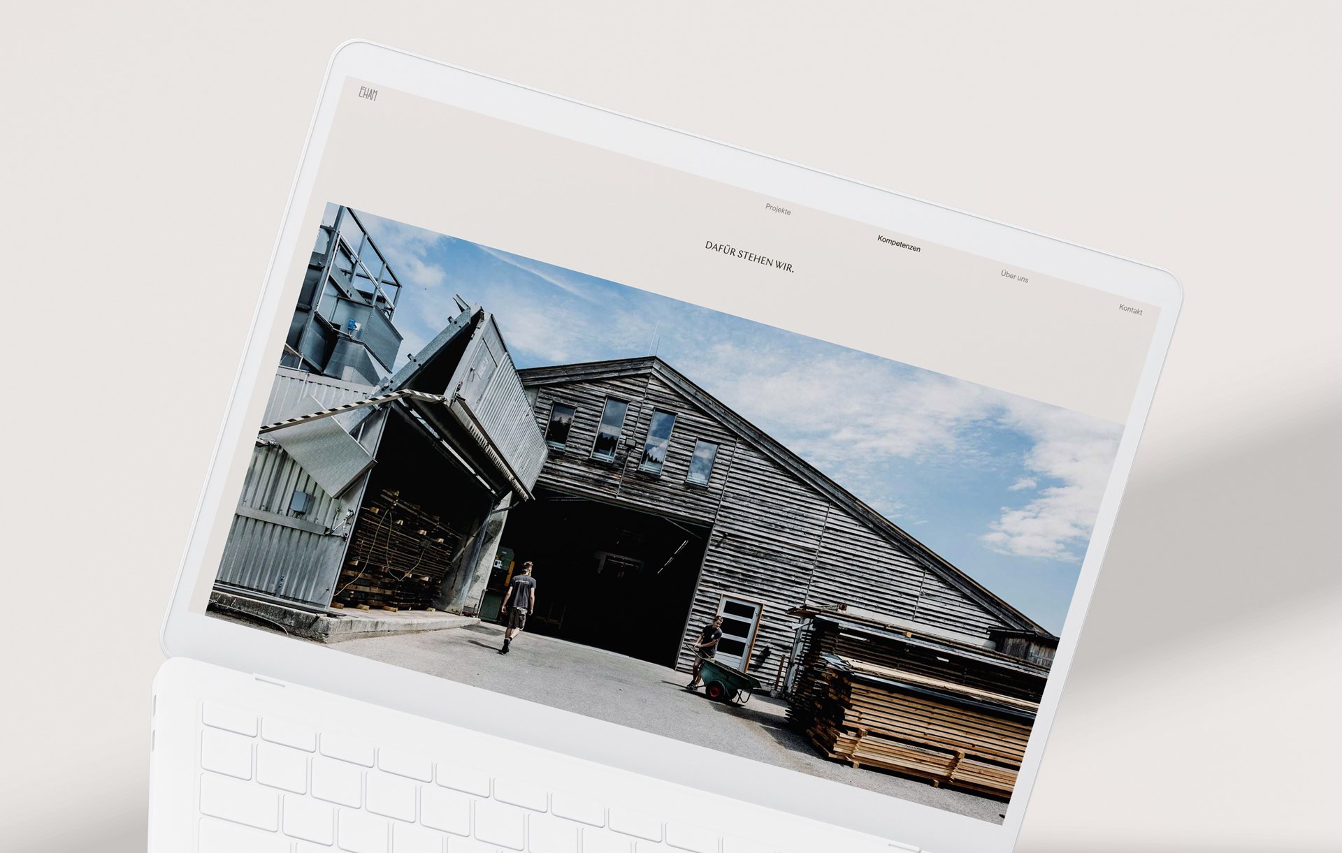
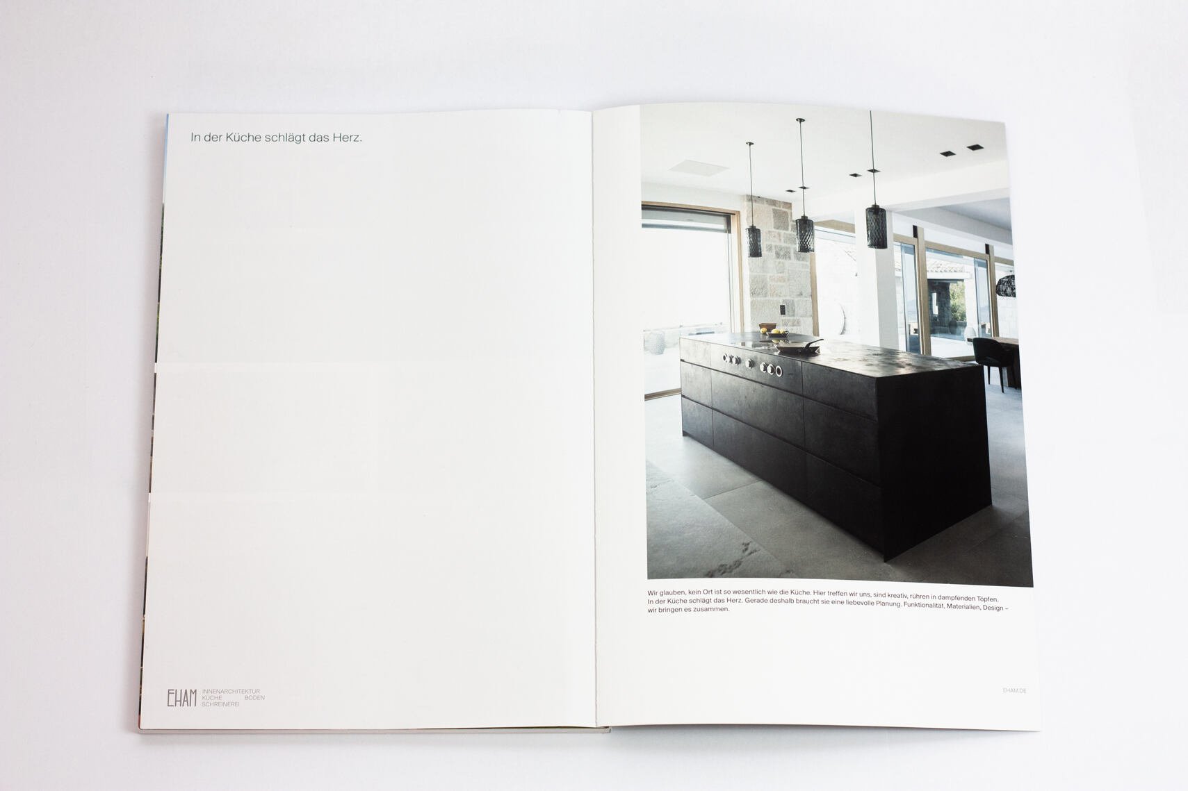
In order to amplify sensory perceptions and the quality of Eham’s work in their digital space, Moby Digg placed a focus on imagery. To seduce viewers and draw them into Eham’s world, the team specifically directed the imagery and videos on the site in combination with the chosen typography. A warm color palette that is reminiscent of wooden hues creates a natural and inviting atmosphere. The new identity expresses elegance and lightness balanced with originality while referencing the use of raw material in Eham’s detail- and quality-driven work.