RGE Consulting
Reimagining RGE Consulting’s visual identity, website design and art direction to reflect their consulting services vision and brand core. Visit website ↗
Introduction
RGE Consulting is a management consulting agency that offers honest and holistic advice to medium-sized financial service providers as well as to bigger companies. They consider their customer’s individual starting points in depth and develop tailor-made solutions accordingly.
Challenge
RGE Consulting approached Moby Digg in Munich to develop the company’s entire corporate identity. The digital design team was tasked with visualizing the seemingly abstract process of consulting. The corporate identity had to contain the clarity and focus of this process without neglecting the creative, controversial thinking RGE Consulting offers their customers.
Approach
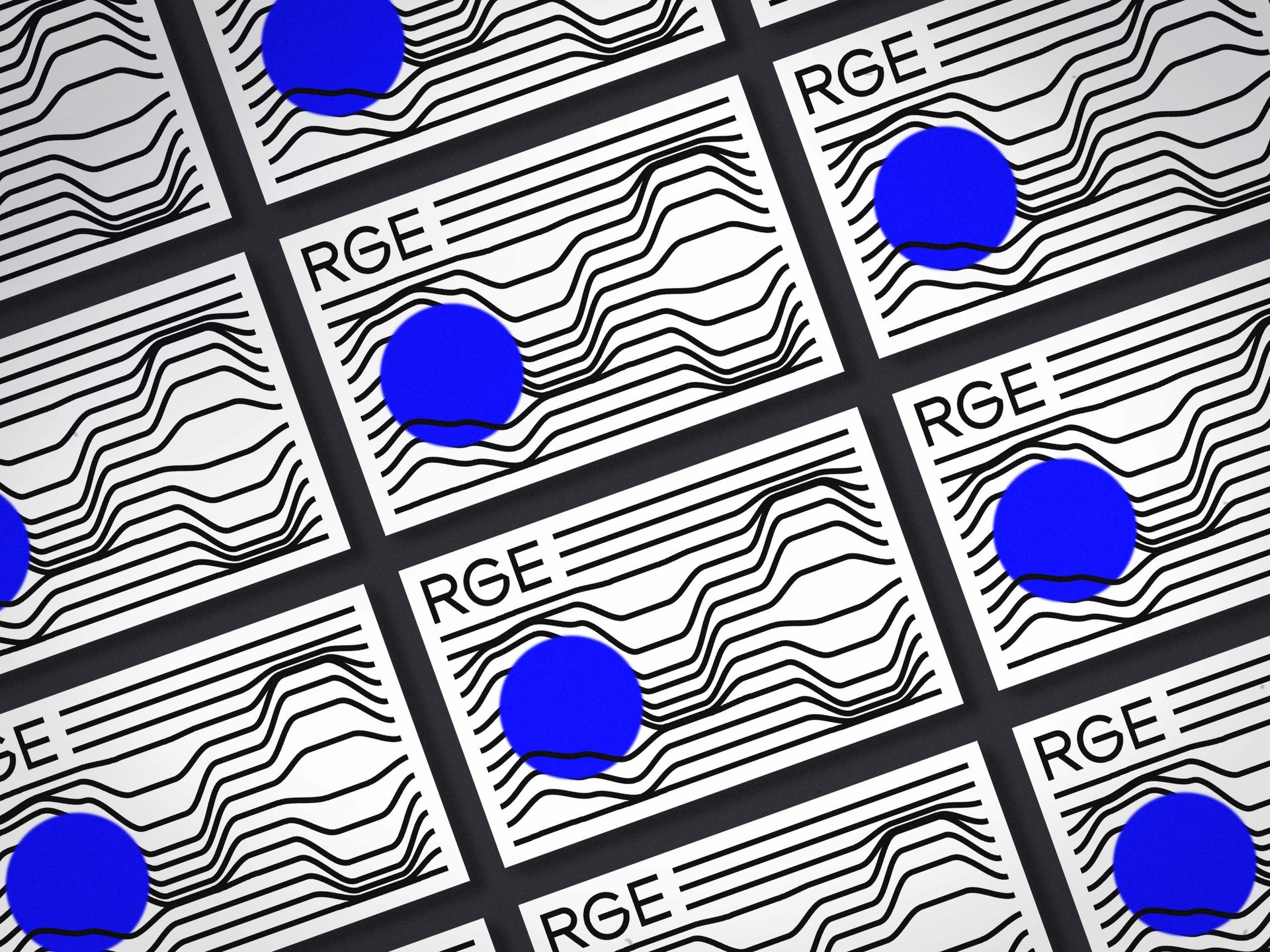
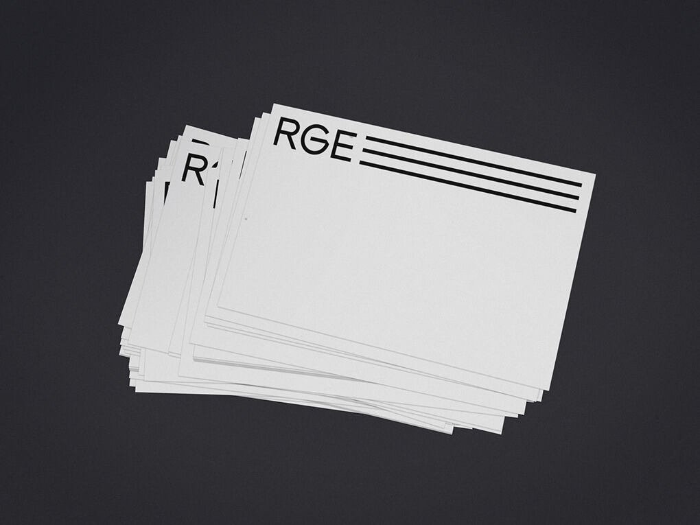
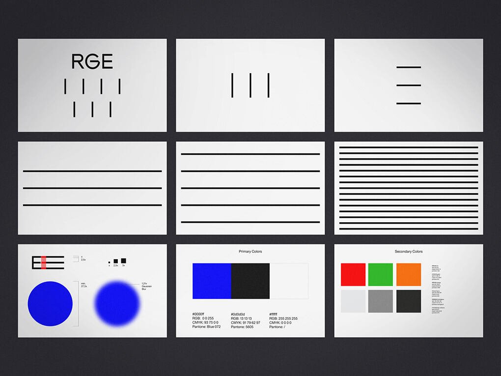
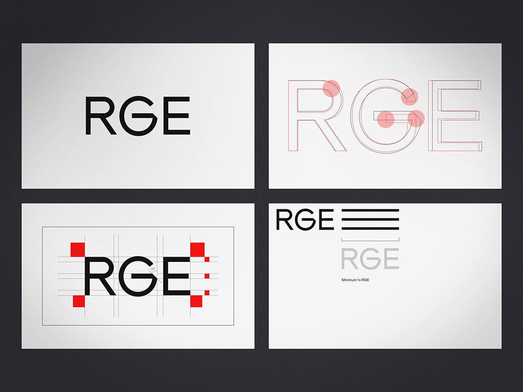
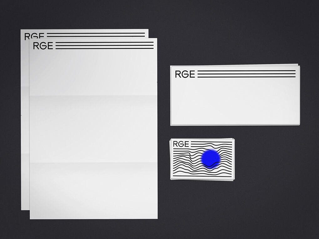
The minimalistic corporate identity derives from RGE Consulting’s three founding partners. Together they form the base of the company and are represented by the three lines in the logo design.
Outcome
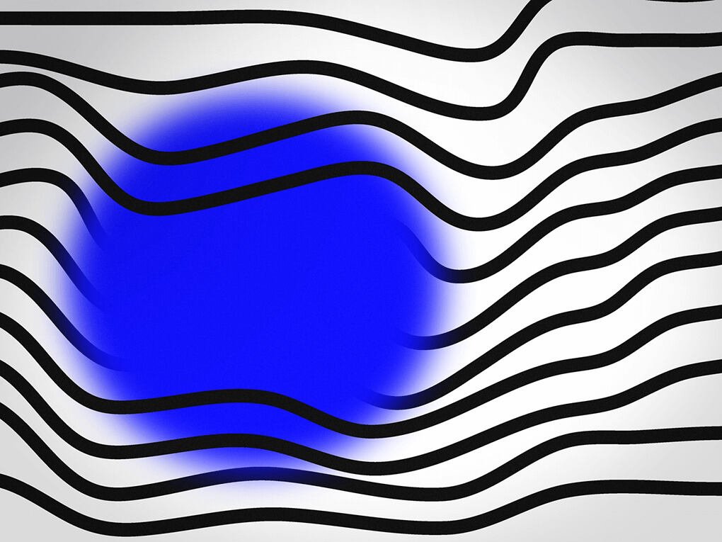
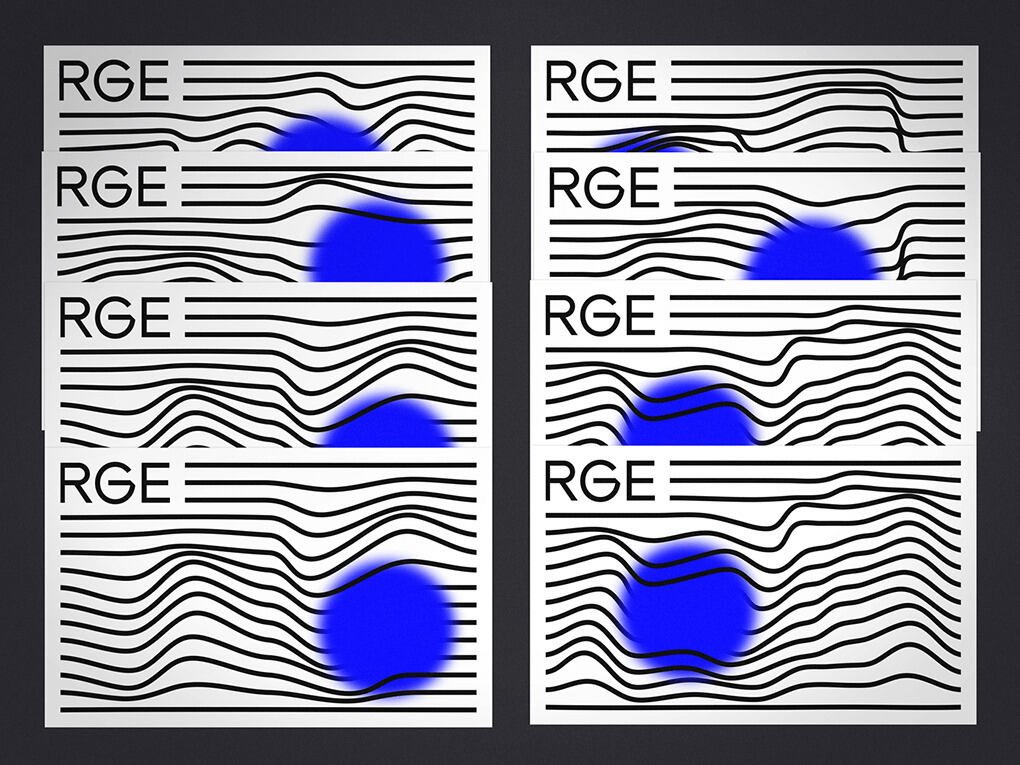
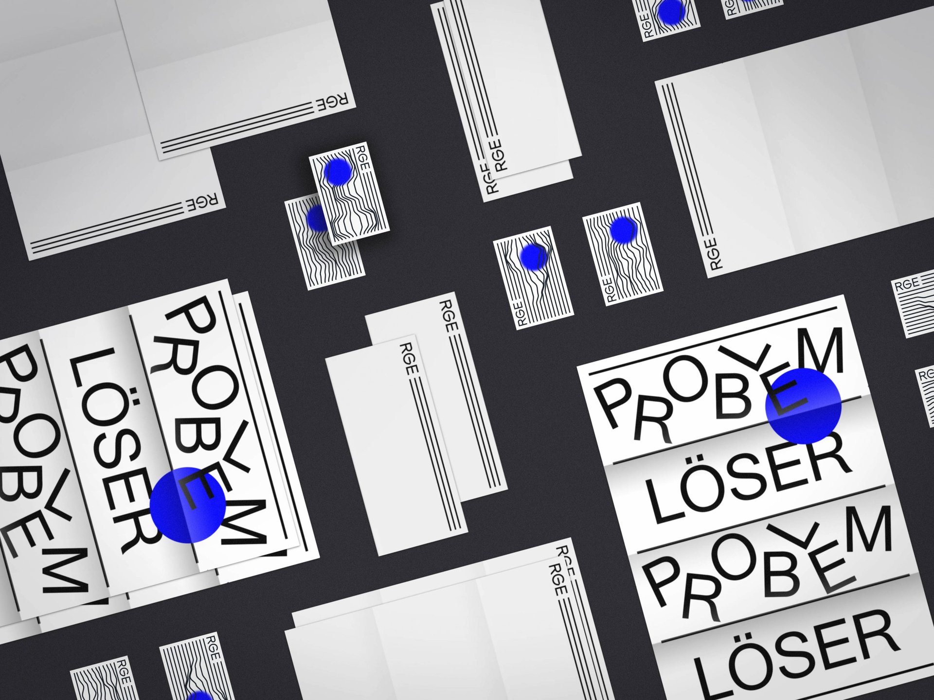
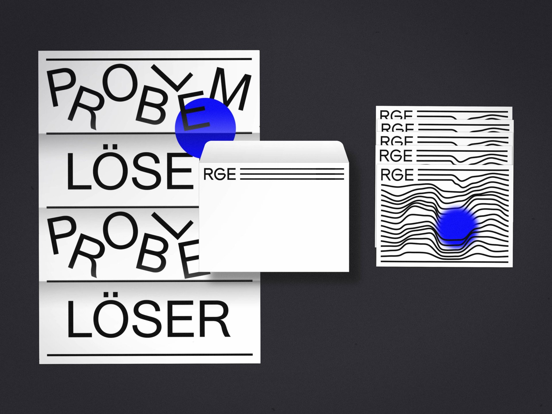
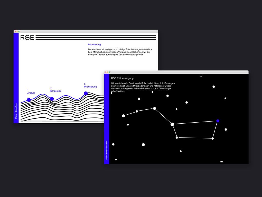
The consulting process is visualized by a system of parallel lines that represent the team of several employees involved in advising a single client. The blue circle mirrors the passion and emotion that go into every project. It can have a huge effect on the path a project ends up pursuing — the parallel lines will shift accordingly.
Impact
The lines not only connect a starting point to an ending, but also symbolize the process of any project. Moby Digg’s simple graphic system and a decisive color combination create familiarity and variability at the same time. The clean approach represents RGE´s consulting services vision and brand core. The key visual itself is animated and encourages subtle user-engagement. The whole corporate identity is based on clarity and the process-based flexibility of RGE Consulting.
