Keep the world moving.
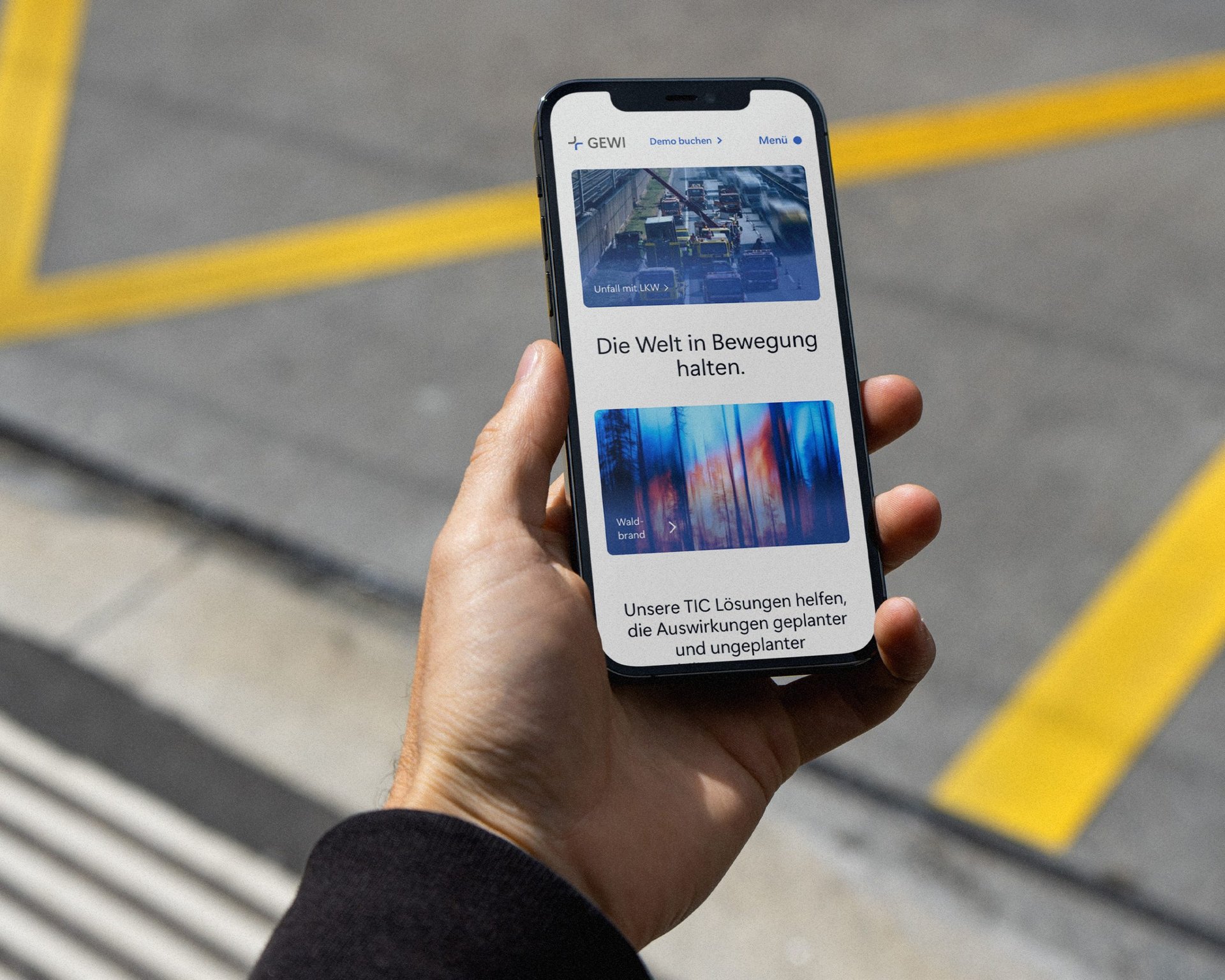
Rebranding and website for the traffic management software developer GEWI.
Introduction
GEWI is the creator of the TIC software, which is used in the field of traffic management for real-time monitoring, analysis and management of traffic data.
They help traffic authorities, service providers and companies to monitor and manage disruptions in road traffic such as accidents, roadworks or traffic jams.
Challenges
Everyday, GEWI’s software products help transportation authorities control the chaos on the roads and ensure the safety of road users. Having not rebranded since 1997, Moby Digg’s challenge was to develop a branding that reflected the company’s reliability, consistency and efficiency, while being in tune with the times.
Approach
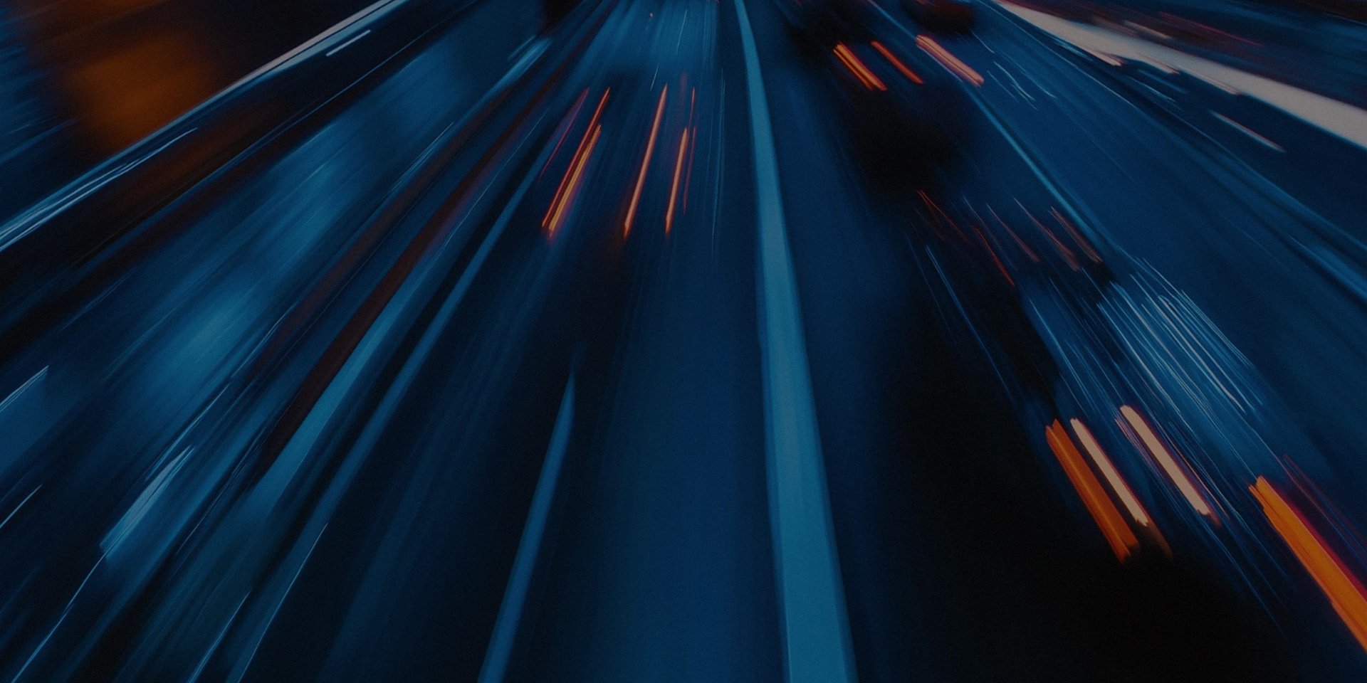
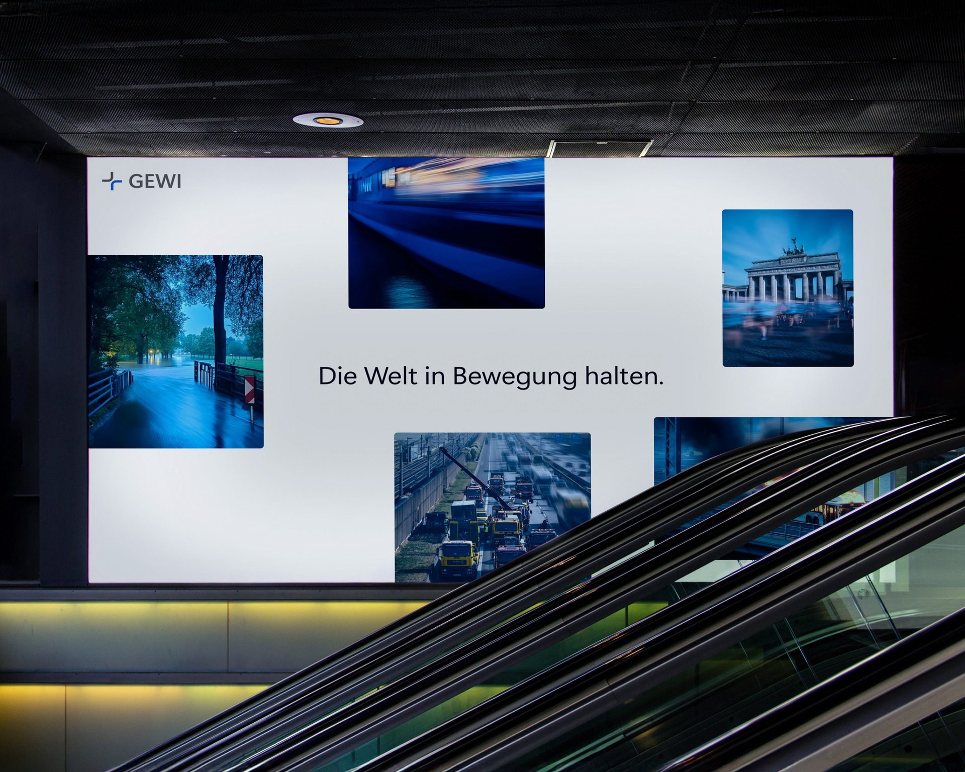
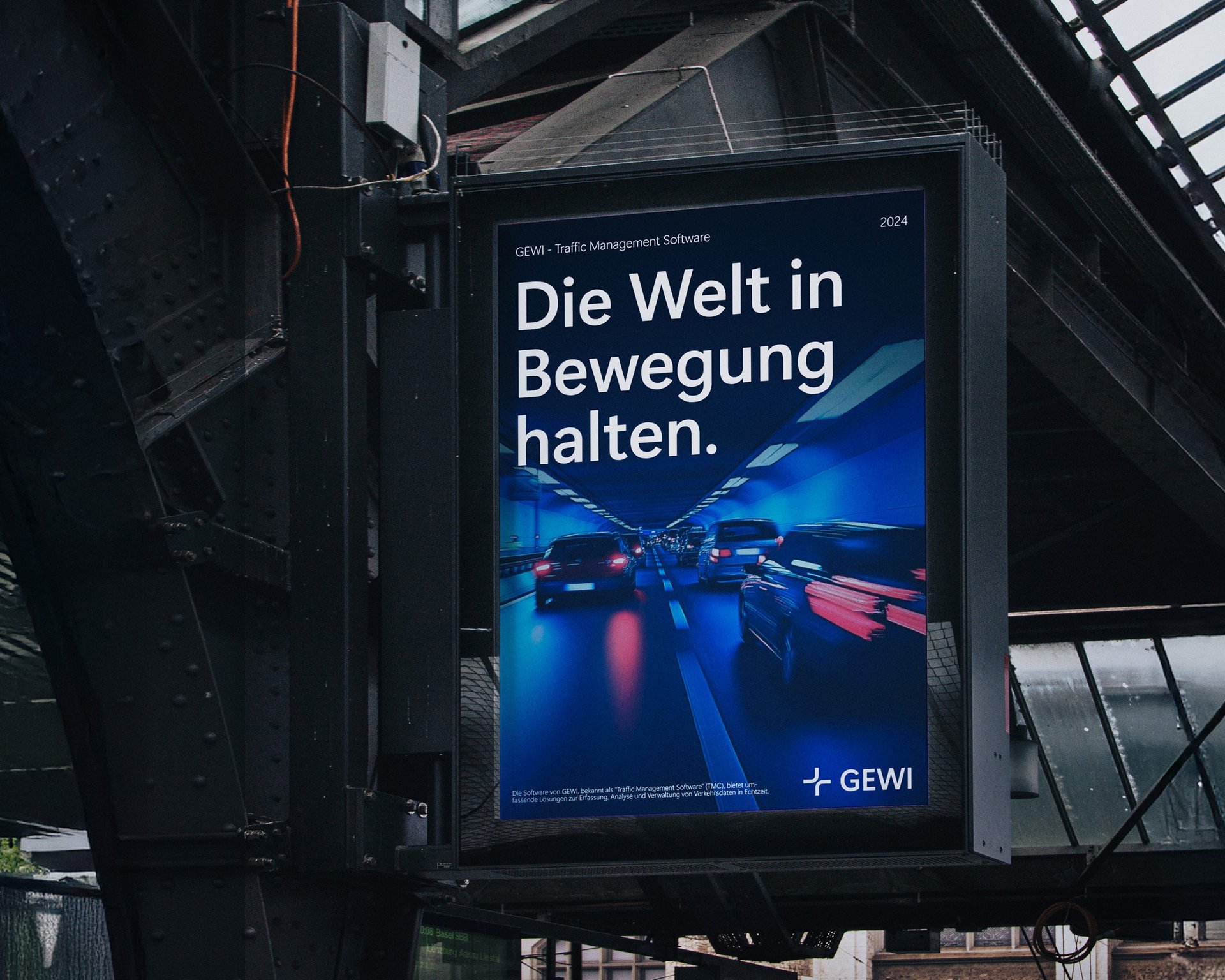
At the beginning of the process, the focus was on developing a new visual language. The GEWI slogan “Keeping the world moving.” served as the central theme and characterizes the entire design of the brand and the website. From the motion blur in the long-exposure photos to the animations on the website – everything conveys a sense of dynamics and movement.
With the help of AI, we generated images to create an awareness for the versatility and variability of the scenarios in which GEWI’s software is used. The colors and dynamics of the design language are picked up in the images and form a visual unity.
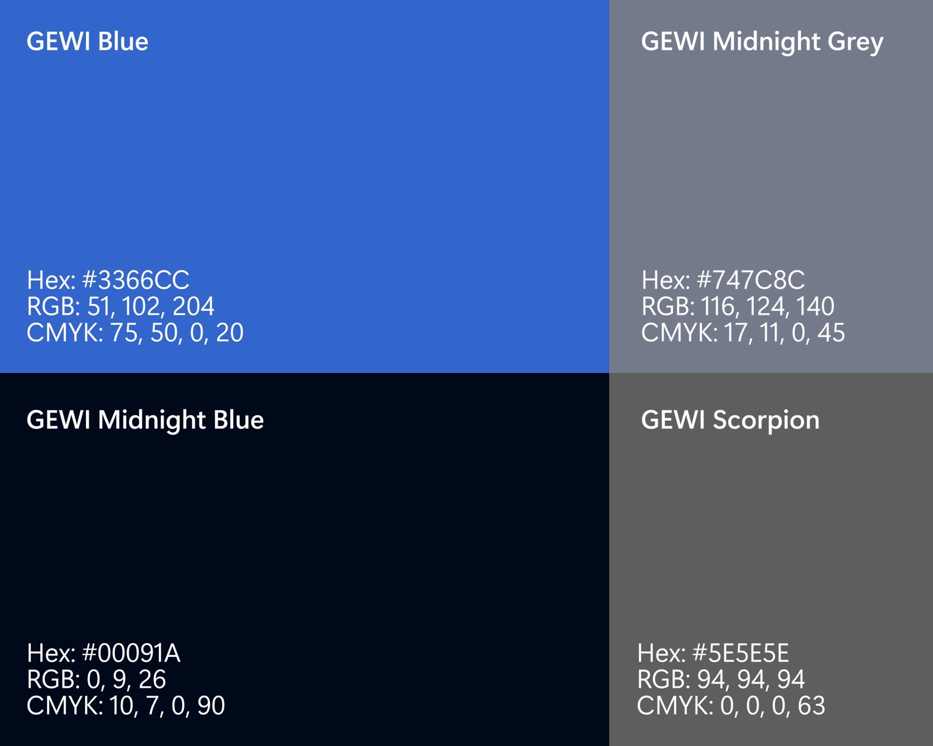
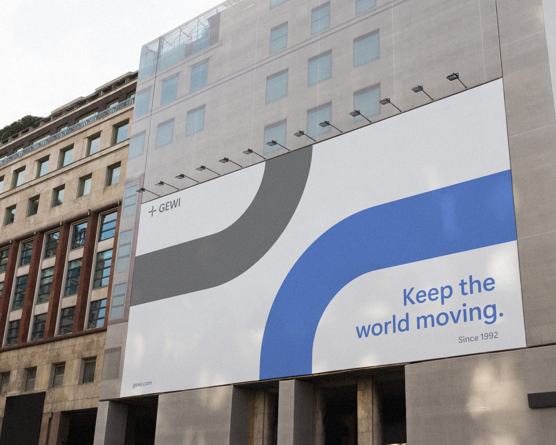
Clear shapes, reduced design patterns and concise colors reflect the core values of the brand and create a feeling of down-to-earthness as well as efficiency and reliability. The colour palette consists predominantly of calming, technical tones of blue and grey, symbolizing safety and professionalism.

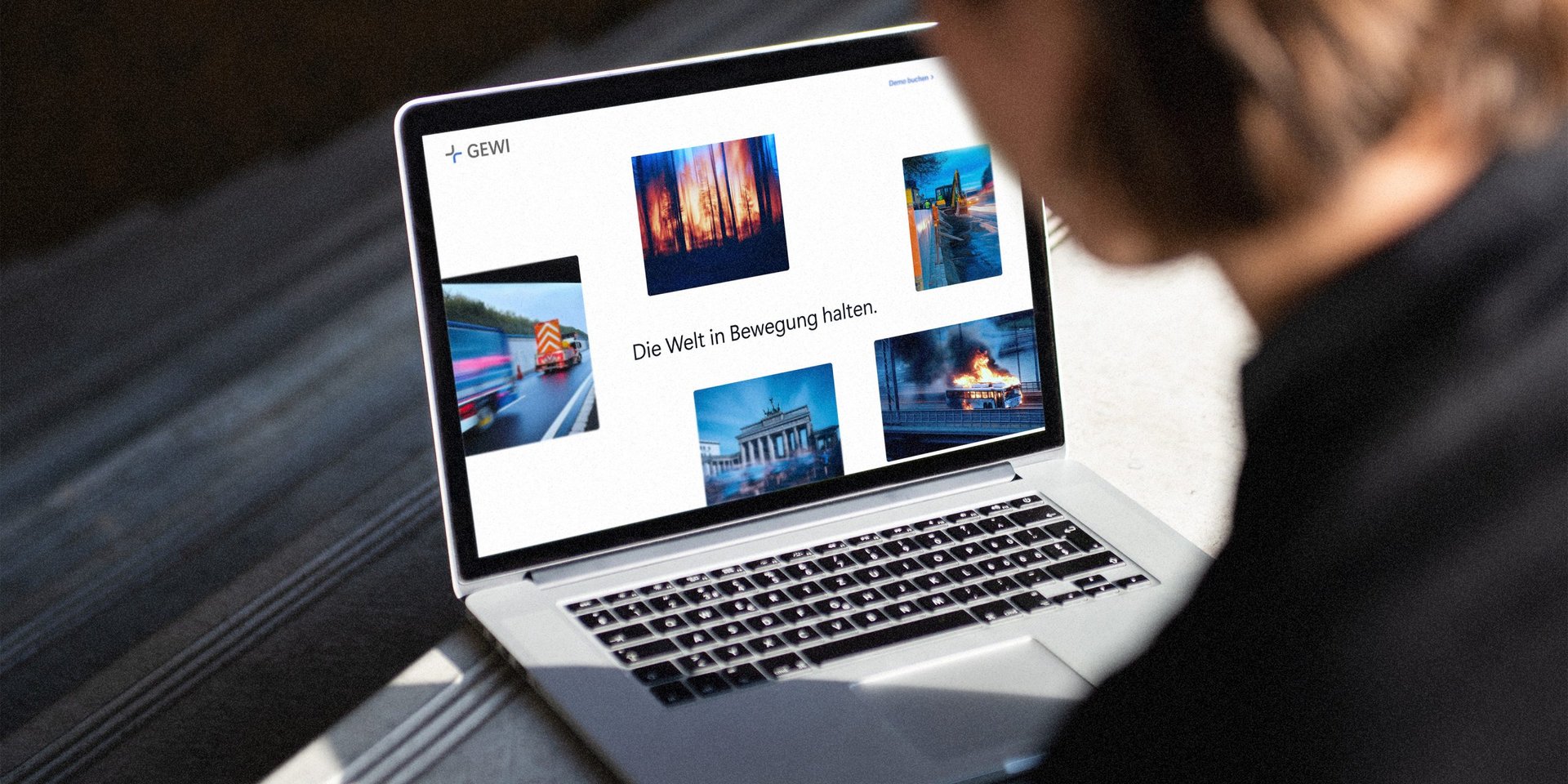
The main focus when designing the website was to transform the company’s core values into a contemporary look and feel without losing its identity. Just like the generated images, the website is inspired by the movement and dynamics of road traffic.
Elements such as the navigation menu are based directly on street maps and guide users intuitively through the content, similar to the network map of a streetcar. The design is also characterized by interactive tiles that ensure calm and stability and thus reflect the company’s consistency.
Result
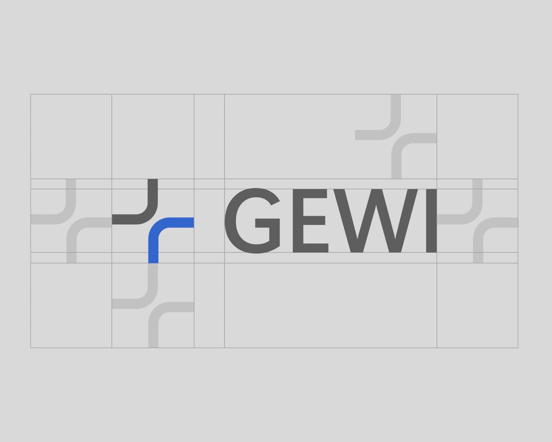
The aim of the project was to give GEWI a new face that bridges the gap between technology and trust. The new website works with many small animations and effects and gives an overview of scenarios, solutions and the history of the company, which goes back to 1992. The logo expresses the core values: Trust, Leadership and Security. The clear lines embody dynamism and adaptability, while the curved elements stand for flexibility and openness. The AI-generated images ensure a consistent appearance and thus strengthen the brand identity, all under the slogan “Keeping the world moving.”
