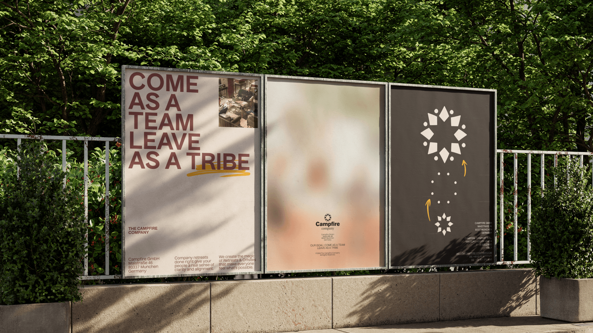
“Come as a Team, leave as a Tribe.” Creating the magic of working together in nature.
Introduction
The Campfire Company specializes in organizing retreats and offsites for businesses, fostering collaboration and team development. They have successfully worked with numerous clients to create impactful retreat experiences. Moby Digg was engaged to rebrand the company and create a visual language that represents its values and mission.
Challenge
We created comprehensive brand guidelines to establish a cohesive and professional look, providing the foundational framework for the Campfire Company to build and expand upon continuously.

Approach
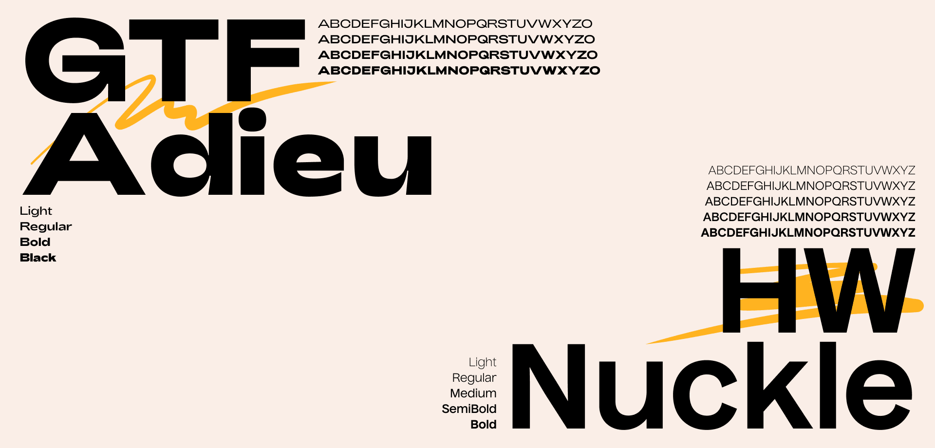
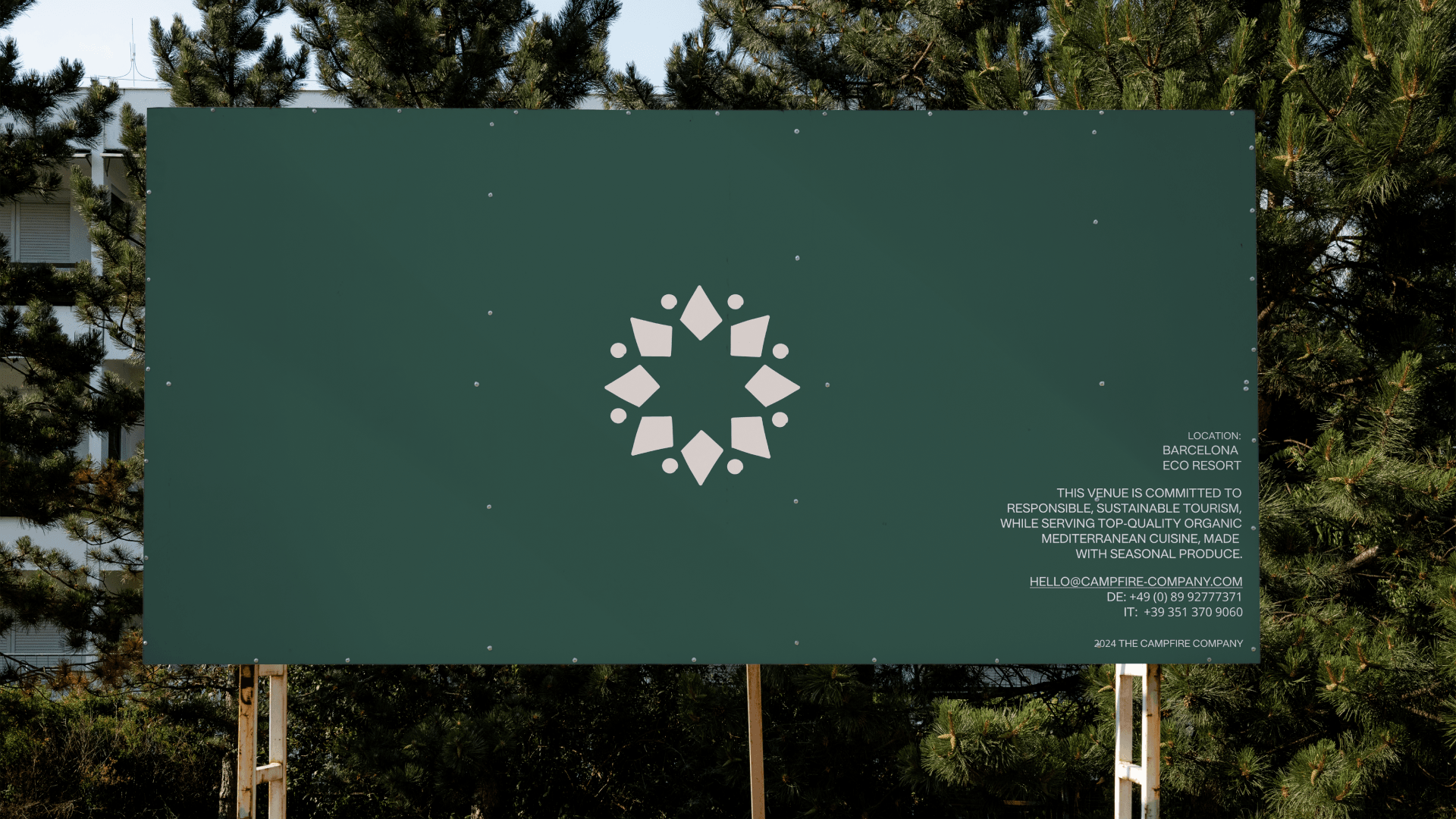
We aimed to capture the essence of the Campfire Company, which transforms professional teams into tightly knit groups through hands-on experiences and exercises. We used a variety of colors reminiscent of a countryside campfire and the outdoors, while maintaining a professional and not overly colorful design. These playful yet professional design elements effectively convey the Campfire Company’s strategy and aspirations.
Outcome
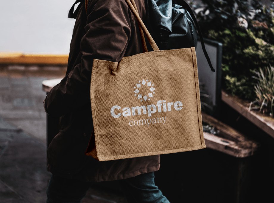
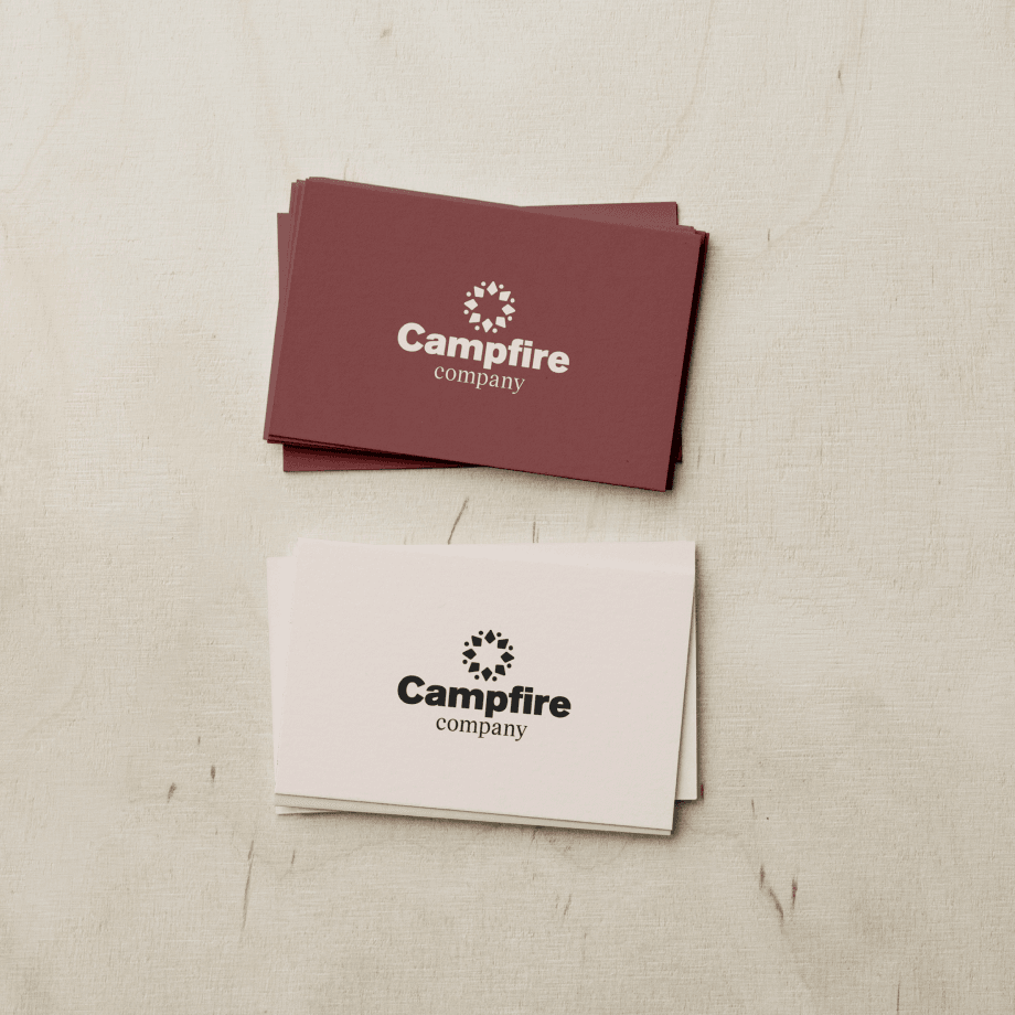
The Moby Digg team designed the Campfire Company’s brand using deep, understated nature colors that convey the intrigue and interaction targeted by the retreats. The logo embodies themes of teams, tribes, and people coming together. Professional yet individualized typography adds a distinct character, while hand-drawn elements highlight and accentuate the overall design and hands-on approach. Lively, action-filled photography captures the dynamic activities and team events at the retreats.